Effective tote bag design involves more than creating attractive artwork. Print specifications, material limitations, colour reproduction, and layout choices all influence the final result.
Before starting your artwork, our tote bag printing service can help you understand how designs translate from screen to print. This guide explores the key design principles that contribute to successful tote bag printing projects.
Still deciding if custom tote bags fit your campaign? Our custom tote bag printing guide covers the benefits and when they make sense.
Table of Contents
- Why Tote Bag Design Matters for Brand Impact
- Artwork Specifications for Tote Bag Printing
- File Formats and Resolution
- Color Mode: RGB vs CMYK
- Print Area Dimensions and Safe Zones
- Design Principles That Work on Fabric
- Keep It Simple and Bold
- Typography That Works at Distance
- Color Strategy for Maximum Impact
- Visual Hierarchy and Balance
- Common Design Mistakes and How to Avoid Them
- Print Method Considerations
- How Material Choice Affects Your Design
- File Preparation Checklist
- Working with Professional Printers
Why Tote Bag Design Matters for Brand Impact
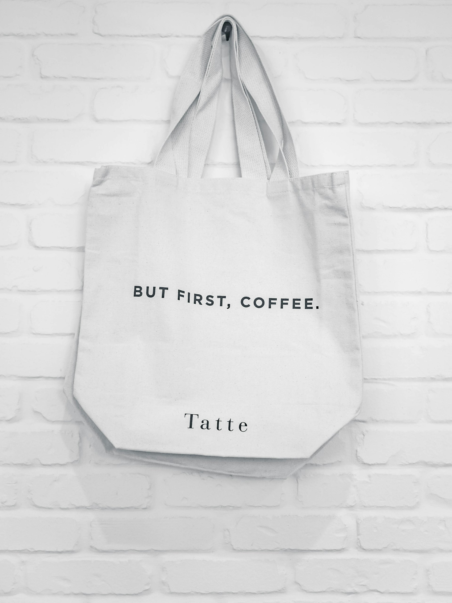
Tote bags aren’t disposable flyers. People reuse them: grocery runs, gym sessions, commutes, events. Every use is a mobile ad.
Design quality determines:
- Brand perception: Professional design signals you care about quality
- Visibility: Bold, clear designs catch eyes from across the room
- Longevity: Good execution resists fading and cracking
- Recall: Simple, memorable designs stick
A thoughtfully designed bag creates positive brand associations. A cluttered, low-quality one does the opposite.
As we covered in our guide comparing tote bags vs flyers, tote bags deliver far more repeated exposure, but only if the design stays clear and appealing over time.
Artwork Specifications for Tote Bag Printing
File Formats and Resolution
File formats we accept:
- PDF (preferred for vector graphics)
- AI (Adobe Illustrator native)
- EPS (universal vector format)
- PNG (for raster images, 300 DPI minimum)
Resolution rules:
- Vector graphics (logos, text): Scalable without quality loss. Always preferred.
- Raster images (photos, complex artwork): 300 DPI at final print size
- Never submit: JPEG files below 300 DPI. They’ll print blurry.
Why vector matters:
Logos and text should always be vector files. Vector scales infinitely without losing sharpness. Your design looks crisp at any print size.
Color Mode: RGB vs CMYK
For screens: RGB (Red, Green, Blue)
For print: CMYK (Cyan, Magenta, Yellow, Black)
Always submit artwork in CMYK color mode for accurate print. RGB colors shift when converted to CMYK. Bright blues, greens, and oranges get hit the hardest.
Pantone matching:
If brand color accuracy is non-negotiable, specify Pantone (PMS) colors. Pantone is the global standard for color matching.
Print Area Dimensions and Safe Zones
Standard print sizes:
- Small prints: 5″ x 8″ (pocket placements, small logos)
- Medium prints: 10″ x 8″ (centered designs)
- Large prints: 15″ x 16″ (full front coverage)
- Jumbo prints: 16″ x 19″ (maximum coverage)
Zones to avoid:
- Handles and stitching: Keep design elements at least 1″ away from handle attachment points
- Side gussets: Don’t put critical text or logos near bag edges that bend or fold
- Bottom seams: Text placed too low may be cut off by the bag base
Put important design elements in these zones and you’ll get readability issues or distorted prints.
Design Principles That Work on Fabric
Keep It Simple and Bold
Tote bags are viewed from a distance. Complex designs lose impact fast.
What works:
- 2-3 colors max: Stronger visual punch than 5-6 colors
- One dominant element: Logo or message. Not five things competing for attention.
- High contrast: Dark text on light backgrounds (or reverse) is readable
Typography That Works at Distance
Font size guidelines:
- Body text minimum: 12pt
- Headlines: 24pt or larger
- Primary message (company name): 36pt+
Font choices:
- Sans-serif fonts (Helvetica, Arial, Futura) read better on fabric than decorative or script fonts
- Avoid thin or light weights: they may not print clearly on textured materials
Common mistake:
Small, thin fonts that look fine on screen but vanish when printed on cotton or canvas.
Color Strategy for Maximum Impact
High-contrast combos:
- Black on white / white on black
- Navy on cream
- Red on white
- Dark green on natural cotton
Low-contrast combos to avoid:
- Light gray on white
- Pastel yellow on cream
- Light blue on white
Material note:
Natural cotton tote bags are usually off-white or cream, not pure white. Designs relying on white elements may not pop. Adjust your palette.
If you’re picking bag materials, our tote bag material guide explains how fabric type affects print clarity and color vibrancy.
Visual Hierarchy and Balance
Hierarchy:
- Primary element: Logo or key message (largest, most prominent)
- Secondary element: Tagline or supporting text (medium)
- Tertiary element: Website URL or contact info (smallest)
Balance:
- Centered designs: Safe, professional, appeals to everyone
- Off-center designs: More dynamic, requires careful alignment
- Symmetry: Polished, stable
- Asymmetry: Adds energy but needs stronger design chops
Common Design Mistakes and How to Avoid Them
1. Low-Resolution Images
Problem: Blurry, pixelated prints
Fix: Use vector files for logos and text; ensure raster images are 300 DPI minimum
2. Overcomplicated Layouts
Problem: Too many elements fighting for attention
Fix: Focus on one strong message; cut unnecessary details
3. Poor Color Choices
Problem: Low-contrast colors that blend into the bag material
Fix: Use bold, high-contrast combinations
4. Ignoring Print Zones
Problem: Text or logos placed over handles, gussets, or seams
Fix: Keep all important elements within the safe print area
5. Wrong File Formats
Problem: Submitting low-quality JPEGs or RGB files
Fix: Provide vector PDFs or high-res PNGs in CMYK
6. Inconsistent Branding
Problem: Off-brand colors, incorrect logos, outdated taglines
Fix: Check brand guidelines and use approved assets
7. Overly Thin Fonts or Lines
Problem: Fine details that don’t translate to fabric printing
Fix: Use medium to bold font weights; avoid hairline strokes
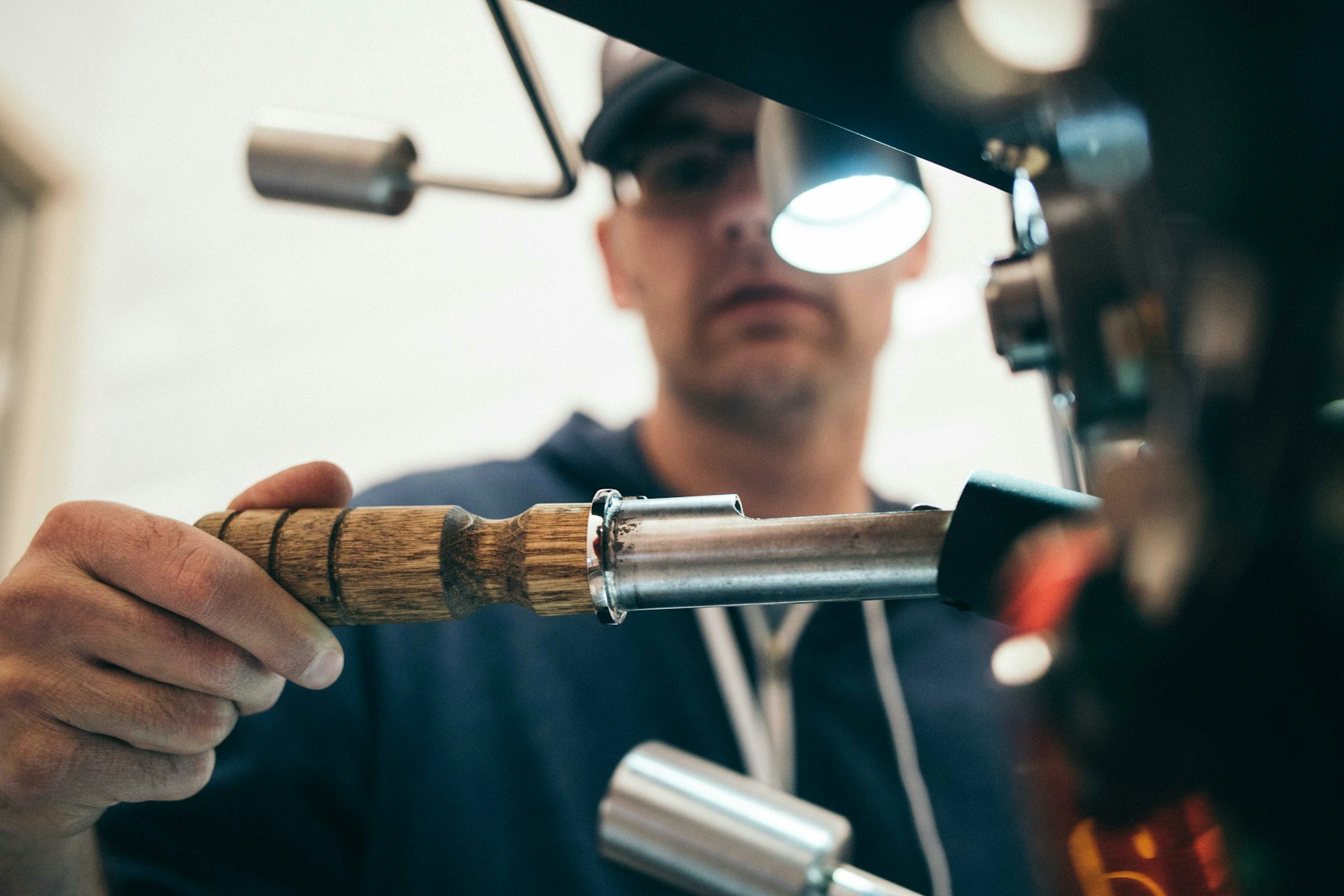
Print Method Considerations
Different print methods have different requirements:
Screen Printing
Good for:
- Bold, solid colors
- Simple designs (1-3 colors)
- Large quantities
Design notes:
- Each color requires a separate screen (more colors = higher cost)
- Works best with vector graphics
- Produces durable, vibrant prints
Heat Transfer
Good for:
- Full-color designs
- Photographic images
- Small to medium quantities
Design notes:
- Supports complex color gradients
- Handles many colors well
- Slightly less durable than screen printing
Digital (DTG) Printing
Good for:
- Full-color, detailed artwork
- Small batches or one-offs
- Photorealistic images
Design notes:
- No color limits
- Handles intricate designs
- Print quality depends on fabric texture
For cost implications of different print methods, see our tote bag printing cost guide.
How Material Choice Affects Your Design
Cotton:
- Smooth surface for clean prints
- Natural off-white tone (adjust colors accordingly)
- Great for screen printing
Canvas:
- Thicker weave shows texture through thin designs
- More durable but slightly less vibrant print results
- Works best with bold, high-contrast designs
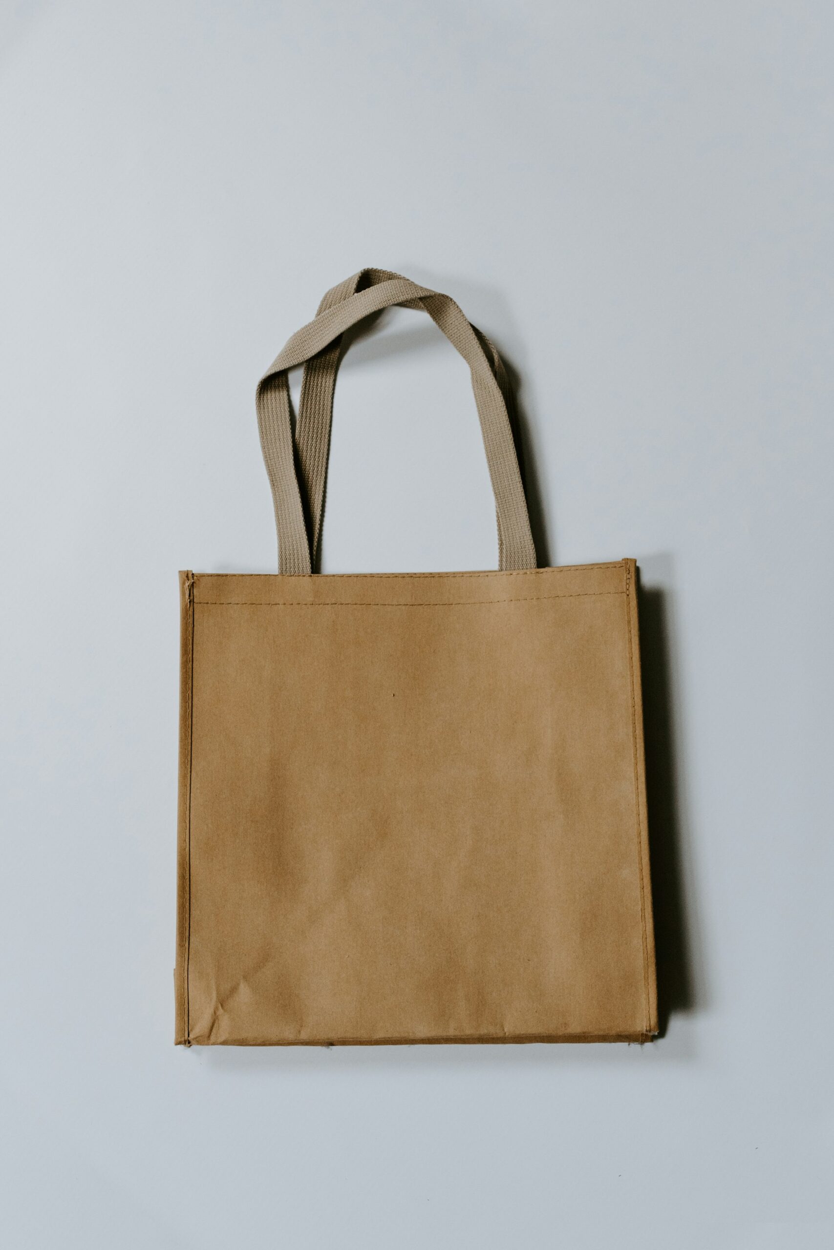
Non-Woven:
- Budget-friendly, less premium appearance
- Smooth surface for basic prints
- Not recommended for complex, multi-color designs
Material selection impacts both print quality and design effectiveness. Our tote bag material guide has detailed comparisons.
File Preparation Checklist
Before submitting your design:
- ✓ File format: PDF, AI, EPS, or PNG (300 DPI)
- ✓ Color mode: CMYK (or Pantone references provided)
- ✓ Resolution: Vector files or 300 DPI raster images
- ✓ Print area: Design fits within specified dimensions
- ✓ Safe zones: No text or logos near handles, seams, or gussets
- ✓ Fonts: Converted to outlines (prevents font substitution errors)
- ✓ Bleed: 0.125″ bleed added if design extends to bag edges
- ✓ Proofing: Reviewed at actual print size on-screen
- ✓ Brand consistency: Correct logos, colors, messaging
Working with Professional Printers
A good printing partner catches problems before they become expensive mistakes.
What experienced printers provide:
- Pre-press file review: Spot issues before production
- Color matching: Pantone or CMYK accuracy
- Material recommendations: Suggest the best fabric for your design
- Proof samples: Physical samples for approval before bulk orders
At Print Print, we review artwork specifications, suggest improvements, and provide proof samples before finalizing production. Our team guides clients through file prep to make sure every tote bag meets brand standards.
Explore our tote bag printing services to see how professional execution turns great designs into effective marketing tools.
Final Thoughts: Design with Print Success in Mind
Tote bag design isn’t just aesthetics. It’s artwork optimized for production. Understanding file specs, design fundamentals, and print methods means your bags look as good in hand as they do on screen.
What matters:
- Use vector files for logos and text (300 DPI minimum for images)
- Provide CMYK artwork (or Pantone references)
- Keep designs bold and simple for maximum impact
- Avoid placing text near handles, seams, or gussets
- Choose high-contrast colors that work with your bag material
Well-prepared designs save time, reduce costs, and deliver professional results. Your brand deserves that.
Planning your next tote bag campaign? Reach out to our team for design guidance and production support.
