


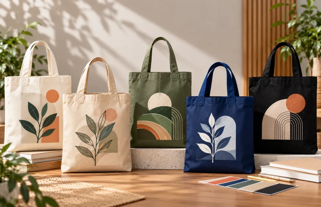
Choosing a tote bag colour may seem like a purely aesthetic decision, but the background colour can directly influence how visible and recognisable the printed logo appears.
A strong logo placed on a poorly matched background can lose contrast. Conversely, a relatively simple design can become highly visible when the bag colour supports it.
Businesses preparing custom bags can explore our tote bag printing service, while our tote bag design guide covers broader artwork preparation.
This guide explains how to choose the best tote bag colour for printing based on logo contrast, material, brand identity, campaign use and printing method.
Table of Contents
- What Is the Best Tote Bag Colour for Printing?
- Why Logo Contrast Matters
- Natural Canvas, White and Other Light Colours
- Black, Navy and Other Dark Tote Bags
- Bright and Coloured Tote Bags
- How Multi-Colour Logos Affect the Decision
- How Material Changes Colour Appearance
- Corporate Gifts, Events and Different Use Cases
- Common Tote Bag Colour Mistakes
- Pre-Production Colour Checklist
- Choose Your Tote Bag Colour with Print Print
- Final Thoughts: Prioritise Contrast and Recognition
What Is the Best Tote Bag Colour for Printing?
There is no single colour that works for every logo.
Quick Answer
Neutral backgrounds such as natural canvas, white, cream, black and navy can be easier to integrate with many corporate identities because they give the artwork a predictable background.
The strongest choice depends on:
- logo colour
- required contrast
- bag material
- printing method
- campaign purpose
- overall brand identity
The bag colour should support the logo rather than compete with it.
Why Logo Contrast Matters
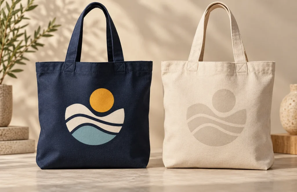
Contrast is the visual separation between the artwork and the background beneath it.
A dark logo generally appears more clearly on lighter backgrounds.
For example:
Dark artwork may suit:
- white
- natural canvas
- cream
- light grey
Light artwork may suit:
- black
- navy
- dark green
- charcoal
This does not mean those combinations are mandatory.
A coloured corporate logo may work well on several surfaces. The key question is whether the logo remains recognisable at the intended print size and viewing distance.
Natural Canvas, White and Other Light Colours
Natural canvas is common because its warm neutral appearance works with many darker logo colours.
It may pair effectively with:
- black
- navy
- dark green
- deep red
- other strong corporate tones
The natural fibre appearance can also contribute to a casual or understated aesthetic.
White creates a cleaner and more neutral background.
It can be especially useful for colourful logos because the underlying bag colour competes less strongly with the artwork.
Cream and other light neutral shades occupy a middle ground.
When branding is already visually complex, a simple background is often the safest approach.
Black, Navy and Other Dark Tote Bags
Dark bags can create a more formal or premium appearance.
Common examples include:
- black
- navy
- charcoal
- dark green
They can work particularly well with white or light-coloured logos.
However, dark bags require more attention to the production process.
A logo designed primarily for use on a white website or document may need a reverse or light version before being printed onto a dark surface.
Printing method may also influence how lighter artwork is reproduced.
Our screen printing vs heat transfer tote bags guide explains how artwork and production method interact.
Bright and Coloured Tote Bags
Strong bag colours can be useful when the bag itself forms part of an event or campaign identity.
Examples include:
- blue
- red
- green
- yellow
- pastel tones
A bright bag can be visually memorable, but the logo still needs sufficient contrast.
Problems arise when both the background and logo contain several strong colours.
For instance, a multi-colour logo printed on another highly saturated colour may lose visual clarity.
Simple branding generally gives businesses more freedom to experiment with stronger bag colours.
How Multi-Colour Logos Affect the Decision
A logo containing several colours is harder to match than a simple monochrome mark.
One portion may appear clearly while another blends into the bag.
Businesses with multi-colour logos should consider:
- whether an approved monochrome version exists
- whether a white/reversed version exists
- which parts of the logo require the most contrast
- whether the bag colour alters the overall balance
Do not redesign official brand colours casually just to make them fit a particular bag.
It may be better to change the bag colour than compromise brand consistency.
How Material Changes Colour Appearance
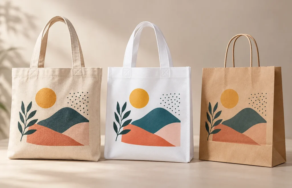
Colour cannot be considered independently from material.
Canvas
Natural canvas has visible fibres and texture. Even an apparently neutral shade may contain warm tonal variation.
Non-Woven PP
Non-woven PP tends to provide a more uniform coloured surface, although texture remains visible.
Paper
Paper bags can create another appearance entirely depending on paper stock and finish.
The same digital colour shown on a monitor should therefore not automatically be expected to look identical across all materials.
Our complete tote bag material guide compares the three material families more broadly.
For material-specific advice, use the canvas, non-woven PP and paper bag material guides.
Corporate Gifts, Events and Different Use Cases
Colour selection may also change according to purpose.
Corporate Gifts
Neutral, dark or brand-aligned colours can create a more restrained presentation.
If the bag itself is intended to become part of the gift, the colour should also be usable beyond the original occasion.
Our best tote bag material for corporate gifts guide covers the broader gifting decision.
Events and Roadshows
A stronger campaign colour can help bags become more visible across an event venue.
However, brand recognition should still take priority over selecting a colour merely because it is bright.
Schools and Community Programmes
Practical considerations such as quantity, material availability and clear institutional branding may matter more than premium appearance.
Retail Merchandise
When recipients are expected to reuse or purchase the bag, colour becomes part of the product itself rather than only an advertising background.
Common Tote Bag Colour Mistakes
Choosing the Bag Before Testing the Logo
A colour can look attractive by itself but perform poorly once artwork is added.
Weak Contrast
Logo and bag colour may be too similar.
Relying Only on a Screen
Digital previews can differ from physical materials because monitors emit light while fabrics and paper reflect it.
Using Too Many Competing Colours
Bright bag + multi-colour logo + additional graphics can create unnecessary visual competition.
Ignoring Material
A colour can appear different on canvas, non-woven PP and paper.
Forgetting the Printing Method
Artwork requirements may change depending on the selected production process.
Pre-Production Colour Checklist
Before confirming the bag, review:
- bag material
- physical bag colour
- primary logo
- reversed/light logo option
- artwork contrast
- printing method
- intended print size
- recipient/use case
- quantity
Where colour accuracy or presentation is especially important, a physical material sample or relevant proof can be useful before proceeding with a larger order.
Choose Your Tote Bag Colour with Print Print

Print Print helps businesses, schools, event organisers and individuals coordinate bag material, colour and artwork through our custom printing services.
Explore our tote bag printing service, or WhatsApp Print Print with your logo, preferred colour, material, quantity and required delivery date for practical production guidance.
Final Thoughts: Prioritise Contrast and Recognition
The best tote bag colour for printing is the one that helps the brand remain clear and recognisable while supporting the intended campaign.
Natural and light colours provide flexible backgrounds for darker artwork.
Black, navy and other dark bags can create a strong appearance when paired with suitable light branding.
Bright colours can reinforce a campaign identity when sufficient logo contrast remains.
Instead of selecting colour in isolation, assess:
- bag colour + logo colour + material + printing method + brand identity
For help selecting a suitable combination, contact us for a consultation on tote bag colour and custom logo printing.
Related Posts
- Why Tote Bag Prints Fade or Crack: Causes and Prevention?
- Custom Tote Bag Printing in Singapore: Smart Branding That Lasts (2026)
- Tote Bag Printing Planning Guide: Timelines, Quantities & Execution
